

Discover the Power of Color Theory: Unlock the Creative Potential of Color Wheels and Combinations!
Have you ever wondered why cold colors like blues and greens can make us feel calmer, while warm colors like reds and oranges evoke passionate feelings? Have you ever looked at a design that seemed off and wondered if it was because of the color choices? If any of these questions have tickled your curiosity, then color theory might be for you. Color theory is an exciting branch of graphic design which looks at how colors interact with one another to create different effects and evoke certain emotions in viewers. By understanding the theory of color, designers can create stunning visual experiences that grab attention and captivate their audience. So let’s jump into the world of vibrant pieces and explore the principles and science of color theory in graphic design!
Have you ever looked at a design and thought to yourself, “This looks off. I wonder if it’s because of the chosen colors?” Or maybe you’ve been curious why cold colors like blues and greens can make us feel calmer, while warm colors like reds and oranges evoke passionate feelings. If so, then you’ll be interested in color theory – an exciting branch of graphic design that examines how colors interact and create different effects in viewers.
Understanding color can give designers the tools they need to create stunning, eye-catching visuals that will grab their viewer’s attention and evoke certain emotions. So let’s dive deep into the world of vibrant colors and explore the principles and science of color theory in graphic design!
Color theory looks at how colors combine, contrast, and interact to create different effects and feelings in viewers. Colors can be divided into three categories: primary colors, secondary colors, and tertiary colors. Primary colors (red, blue, and yellow) cannot be made from any combination of other colors, and are the building blocks of all other colors. Secondary colors (orange, green, and purple) are made from mixtures of two primary colors, and tertiary colors (yellow-green, blue-green, etc.) are made from mixtures of primary and secondary colors.
When it comes to graphic design, understanding the impact of colors can be the key to creating stunning visuals that captivate viewers and evoke certain emotions. For example, using warm colors like reds and oranges can create a feeling of energy and excitement, while cool colors like blues and greens can evoke a feeling of calm and tranquility. Using contrasting colors can create a sense of tension and energy, while using colors that blend together can create a sense of harmony and unity.
By understanding color theory, designers can create visuals that are not only visually appealing, but also evoke certain emotions in viewers. Color theory can be a powerful tool to help designers create stunning works of art that grab attention and captivate their audience. So if you’re looking to add a little bit of vibrancy to your designs, why not take a dive into the exciting world of color theory and see what it can do for you?
Red
Reds are one of the most eye-catching colors in the spectrum. They range from the energetic, passionate primary red to the softer, more muted colors. Reds evoke strong feelings and emotions, making them an ideal choice for a wide range of applications.
In color theory, red is considered a primary color, along with blue and yellow. Primary colors cannot be created by mixing any other colors, and they are used to create all other colors of the spectrum. Red also has a unique ability to stimulate energy, making it an ideal choice for logos, advertising, and other applications that require a bold look.
Reds are often associated with passion, adventure, and power. A red background can be used to draw attention to text or important imagery. It can also be used to evoke feelings of energy, joy, and excitement.
When it comes to decorating, red is a great color choice for making a bold statement. From bright scarlet walls to deep, rich burgundy curtains, red can add character to any room. Reds can also be used to create a cozy atmosphere, with warm, inviting tones.
Reds are versatile and can be used in combination with other colors to create unique, eye-catching designs. For example, pairing primary red with a lighter blue or yellow can create a cheerful, vibrant look. Or, mix deeper shades of red with neutral colors to create a calming, sophisticated atmosphere.
Whether you’re looking to make a bold statement or create a cozy atmosphere, reds can help make your space stand out. With its ability to evoke strong feelings and emotions, red is a great choice for any decorating project. So don’t be afraid to add a little red to your home – you won’t regret it!
Orange
Orange is a color with a lot of personality and can create powerful emotions and feelings. It is a bright and eye-catching color and is a combination of two colors – red and yellow. It is often referred to as a tertiary color, as it combines the attributes of both the primary and secondary colors.
From a color theory perspective, orange is associated with positive energy and enthusiasm. In fact, it’s often referred to as the color of joy and creativity. Orange is also associated with feelings of warmth, comfort and optimism. For these reasons, orange can be a great choice for an energizing, engaging and uplifting look.
The color orange has a wide range of applications. From home decor to fashion, orange can be found everywhere. Its bright and warm tone makes it a great choice for the summer months, and its upbeat feel works well in corporate settings. Orange is often found in art, as it is a color that is both energizing and calming.
When it comes to marketing, orange is a great choice for creating an eye-catching logo or promotional material. Orange is associated with energy and enthusiasm, making it a great choice for promoting new products or services.
Overall, orange is a color with a lot of personality and can create powerful emotions and feelings. Whether you are using it to create a warm and inviting atmosphere or to promote a product or service, orange is a great choice.
Yellow
It’s no secret that the color yellow is eye-catching. From the softest shades of buttery yellow to the brightest hues of canary yellow, this primary color has the unique ability to evoke strong feelings and emotions.
What is it about yellow that makes it so appealing? A deep dive into the world of color theory reveals the answer.
Yellow is the hue of happiness, optimism, and positivity. It’s often associated with joy, cheerfulness, and energy. It’s also the color of creativity and renewal, making it a popular choice among artists and designers.
The color yellow is also visually stimulating. It stands out in a crowd and is often used to draw attention to an important item or message. From bright yellow caution signs to cheerful yellow flowers, this primary color is sure to grab your eye.
Not only is yellow attractive, it also has a calming effect. Studies show that looking at the color yellow can help reduce stress and improve concentration. It’s an ideal choice for classrooms, office spaces, and other areas that require a calming environment.
Whether you’re looking to create an upbeat atmosphere or peaceful space, yellow is an ideal choice. Its vibrant hues can evoke feelings of joy, while its softer shades provide a calming environment. Its versatility makes it an ideal choice for any space.
So, the next time you’re searching for a color to add to your space, consider yellow. Its engaging appeal and calming effects make it a great choice for any décor.
Green
Green is a color that is often associated with feelings of growth, renewal, and freshness—which is why it’s such an eye-catching and dynamic color selection. From light shades of mint green to deep emerald greens, the color green has a variety of hues to choose from and can be used in many different contexts.
When it comes to color theory, green is a secondary color, made up of the primary colors blue and yellow. Green is often seen in nature, as it’s the main color in plants and foliage. As a result, it’s a popular choice for designers and decorators, who often use the color to bring a sense of serenity, peace, and calm to a space.
Green is also a color that can evoke strong emotions in people. It can be used to create an atmosphere of growth, hope, and ambition. For example, many professional sports teams use green in their branding, to symbolize ambition and drive.
Green can also be used for decoration in a variety of ways. From vibrant walls to furniture and accessories, green is an eye-catching way to bring a sense of vibrancy and life to a space. Whether you’re looking for a subtle accent or a bold statement, green is a great way to make a room stand out and capture the eye of onlookers.
No matter what the context, green is a great color to work with. With its range of hues, its associations with nature, and its ability to evoke strong emotions, green is an engaging and versatile color that can be used in a variety of ways.
Blue
When you think of blues, you might think of the classic color theory of primary colors and how they mix to create a color palette. But blues can evoke so much more than just the combination of two colors. It is a color that evokes a variety of feelings and emotions. From the light, airy feeling of the sky to the deep and mysterious depths of the ocean, blues have an eye-catching quality that draws us in.
The range of blues is vast and varied, from the soft powder blue of a baby’s nursery to the dramatic navy of a formal suit. Each shade of blue carries with it a unique emotion, engaging the viewer and inspiring a range of reactions. Whether it’s the calming effect of a light turquoise or the bold, vibrant hues of a cobalt blue, the shades of blues can provide us with a sense of comfort and security.
From a design perspective, blues are incredibly versatile and can be used to create a wide range of aesthetically pleasing spaces. Whether it’s a classic navy and white combo or an unexpected blend of cobalt and turquoise, blues can be used to create an atmosphere that is both calming and invigorating. Additionally, blues are great for creating a cohesive look across a room, connecting different elements and tying them together.
On a more personal level, blues are a great way to express your innermost feelings and emotions. Whether it’s a cheerful sky blue or a deep and mysterious navy, blues can help us express the way we feel and allow us to create a space that reflects our personalities.
Whatever your reason for embracing the blues, it is an incredibly versatile and eye-catching color that can transform any space. From a design perspective, blues can create cohesion and a soothing atmosphere, while on a personal level, they can evoke a variety of emotions and help us express our true selves. What’s more, blues provide a range of hues to suit any taste and can be used to create an unforgettable and engaging experience.
Violet
Violet is an eye-catching color that evokes strong emotions and feelings. It is one of the primary colors in the color wheel and is often used in color theory to create feelings of tranquility and serenity. It is also associated with royalty, wisdom and mystery.
Violet can be a powerful color when used in the right way. It is a great choice for marketing and branding purposes as it stands out and can create an air of sophistication and wisdom. It is also great for creating a calming atmosphere and its hue can help to bring a sense of peace and relaxation.
When used in interior design, violet can bring a unique and striking look to any room. It can be used to create a dramatic effect, or a more subtle one, depending on the situation. It can be a great choice to bring a sense of stylishness and elegance to any room.
Violet is also a great choice for fashion. It can help to bring a sense of power and luxury to any outfit. It can be used to create a look that is both engaging and stylish. When used in the right way, it can be a great way to make a fashion statement that stands out.
Violet is an incredibly versatile color and can be used in a variety of different ways to create a range of different effects. It is a great choice for anyone looking to create a unique and stylish look. Whether you are looking to create a dramatic or calming atmosphere, or looking to make a fashion statement, violet can be a great choice.
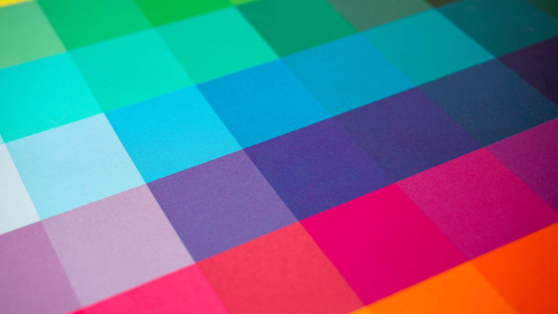
What is a Color Wheel?
The color wheel was first developed by Sir Isaac Newton in 1706 and is based on the three primary colors: red, yellow, and blue. Starting with these three colors, the color wheel is then divided into twelve sections, each with a different hue. These twelve hues are then combined in various ways to create secondary and tertiary colors.
The color wheel is a great tool for artists and designers alike. It’s a helpful guide for choosing a color palette for any project. For example, a designer may choose analogous colors, which are colors that are located next to each other on the wheel. Alternatively, they may opt for complementary colors, which are colors that are located directly opposite of each other on the wheel.
On a more practical level, the color wheel is also used by interior decorators and fashion designers. For example, a decorator may choose soothing pastels or bright vivid colors to create a certain ambiance in a room. A fashion designer might use analogous colors to achieve a bold, eye-catching look.
In the end, the color wheel is a great tool for unlocking the power of color. Whether it’s used to evoke certain emotions or to create an eye-catching design, the color wheel can help bring any project to life. So, the next time you are creating something, consider using the color wheel to find the perfect hue.
Colour Theory Combinations and Color Schemes
Colour Combinations and Color Schemes is your go-to for bringing your project to life with the perfect color combination. With an engaging tone, explore the possibilities of complementary, analogous, triadic, monochromatic, and neutral colors today and learn how to express yourself through color. Unlock the power of colors to create feelings, evoke energy, and make your project pop with the right color schemes.
Complementary
When it comes to creating dynamic and visually intriguing artwork, complementary colors are a go-to style choice for many. Complementary colors are opposite of each other on the color wheel, such as red and green, blue and orange, yellow and purple and more. Rooted in the fundamentals of art theory, this style is often used to create dramatic contrast and bring a sense of energy to any piece. By utilizing contrasting elements, a complementary color scheme can be used to create eye-catching scenes that grab the attention of viewers. When used thoughtfully, complementary colors can create an impressive visual masterpiece with nothing but color. So if you’re looking to add something special to your next design project, try exploring complementing colors and see how far they can take you!
Analogous
Analogous colors are a powerful design tool. By combining hues that are adjacent to each other on the color wheel, designers can create an aesthetically pleasing, unified look. From bold contrasts to subtle gradations, analogous colors provide a pleasing range of options for creating visual interest. When used in interior decoration and fashion, these harmonious shades often give a sense of serenity and restfulness. With a few simple strokes, analogous colors can add depth and dimension to a two-dimensional image. So next time you need to make your project pop, don’t forget the power of analogous colors.
Triadic
Triadic color combinations are a great way to add some visual interest and balance to a design. By combining three colors that are evenly spaced around the color wheel, you’ll get a vibrant, energetic look that can make any design stand out. This unique combination of colors can be used in logos, branding materials, websites, and more! Keep in mind that when using triadic colors, it’s important to look at how each color interacts with one another as well as how they’re used together. Too much contrast between the colors may lead to a jarring result, while too little contrast will result in a bland design. Experiment with different shades and tints to find the perfect balance of interactive and complimentary hues.
Monochromatic
Monochromatic color schemes can help to create a sophisticated and unified look for any design project. By using variations of one color, you can create a cohesive and aesthetically pleasing design. This type of color selection can be used in a variety of ways – from fashion to interior design – and is particularly effective when used in logo design, web design, and product packaging. Monochrome colors are also great for creating moods, conveying emotions, and highlighting important elements in a design. If you’re looking for an easy way to create a unified and modern look, try using a monochromatic color palette in your next project!
Neutral
Neutral colors are the perfect choice for a timeless, classic look. Whether you’re aiming to create a sophisticated environment in your home or office, this type of color palette can help you achieve your desired aesthetic. By using shades of black, white, and grey, you can create an atmosphere that is both subtle and stylish. Neutral colors can also be used to bring out other colors in a room; they enhance bold hues and add depth to more muted tones. When creating a neutral color scheme, think beyond just the walls—flooring and furniture can also be incorporated into your design plan without distracting from the overall look. So if you’re looking for a look that’s sleek, modern, and always in style, then neutral colors are the way to go!
Final Words
As designers, it is essential to understand the science and principles of color theory when creating designs. Color can be used to create beautiful and captivating visuals that grab the viewer’s attention and evoke certain emotions. Without understanding how colors interact with each other, a design has the potential to fail and fail to connect with its viewers. By becoming familiar with color theory, designers gain the knowledge they need to create stunning visuals and a successful design.
